Book Layout: The Complete Guide to Professional Page Design
Learn how to create a professional book layout with proper margins, trim sizes, and page design. Covers fiction, nonfiction, workbooks, and more.


Grab any book off your shelf. Before you read a word, the layout has already told you something. Wide margins and generous spacing? Probably a literary novel. Dense two-column pages with sidebars? Reference guide. A full-bleed photo opposite a single paragraph? Coffee table book.
Layout is the invisible architecture behind every reading experience. When it works, readers move through pages without friction. When it doesn't, even great writing feels amateurish — the kind of self-published book people put down after three pages.
What Is Book Layout?
Book layout is how you arrange every visual element on every page. The text block, margins, headers, footers, page numbers, chapter titles, images, captions, pull quotes, sidebars, and all the white space between them.
Think of it like interior architecture. An architect decides where walls, doors, and windows go. A layout designer decides where text, images, and empty space go. Same goal: make a space that's functional, comfortable, and visually coherent.
Layout isn't writing, editing, or picking fonts. It's specifically about spatial arrangement — where things sit on the page and how they relate to each other visually.
Book Layout vs. Typesetting vs. Formatting
These three terms overlap, and people swap them around a lot. But they're actually different layers of the same process:
In practice, these three happen together. A professional interior designer handles them all in one pass. But knowing the difference helps you think clearly about what you're actually doing at each stage.
The Anatomy of a Book Page
Before you can design a layout, you need to know the parts of a page and the terms designers use for them.
The Text Block
The text block is the rectangle where your body text lives. Margins surround it on all four sides. Its size and position on the page is the single most important layout decision you'll make. It controls how much text fits per page, how the book feels in the reader's hands, and how professional the interior looks.
Too large (narrow margins) and it feels cramped and suffocating. Too small (wide margins) and it wastes paper, making the book feel padded. For most book types, aim for the text block to fill roughly 60-70% of the page area.
Margins
Every page has four margins:
- Top margin (head): The space above the text block. Running headers usually sit here.
- Bottom margin (foot): The space below the text block. Page numbers often go here.
- Inside margin (gutter): The space between the text block and the spine. This needs to be wider than the outside margin because some of it disappears into the binding.
- Outside margin (fore-edge): The space between the text block and the outer page edge. This is where the reader's thumb rests.
This positions the text block slightly above center and toward the spine — which feels balanced and natural. Modern book design sometimes simplifies this, but making the bottom margin the largest is still standard.
Recto and Verso Pages
This matters because:
- Chapter openings traditionally start on recto (right-hand) pages. If a chapter ends on a recto page, the next verso is left blank so the new chapter can start on the following recto.
- Running headers on verso pages typically show the book title or section name. Recto headers show the chapter title (nonfiction) or author name (fiction).
- The gutter margin is on the left side of recto pages and the right side of verso pages — they mirror each other.
Always design in terms of two-page spreads, not single pages. The spread is what the reader actually sees.
Headers and Footers
Standard conventions:
- Fiction: Running headers are optional. When used, the verso shows the book title and the recto shows the chapter title or author name.
- Nonfiction: Running headers are almost always used. Verso typically shows the book or part title. Recto shows the chapter or section title.
- Both: Headers and footers are left off chapter opening pages, part title pages, and blank pages.
Page Numbers (Folios)
- Placement: Bottom center is most common for simple layouts. Bottom outside corner (left on verso, right on recto) is standard for nonfiction. Top outside corner works when the running header includes the page number.
- Style: Arabic numerals (1, 2, 3) for the body. Roman numerals (i, ii, iii) for front matter (preface, table of contents, foreword).
- When to skip them: Page numbers are suppressed on blank pages, half-title pages, title pages, copyright pages, part title pages, and chapter opening pages (the page still counts in the sequence, though).
Trim Size
Trim size affects everything: margin widths, text block dimensions, font size, line length, and overall feel. A 5" x 8" book with the same text as a 6" x 9" will have shorter lines, more pages, and need different margin proportions to look right.
Common Trim Sizes and Their Ideal Margins
Here are the three most popular trim sizes for print books, with margins that produce professional results:
6" x 9" (Most Popular for Nonfiction)
The standard for business books, self-help, memoirs, and general nonfiction. Enough width for comfortable line lengths and enough height to feel substantial.
- Inside (gutter): 0.75" - 0.875"
- Outside: 0.625" - 0.75"
- Top: 0.625" - 0.75"
- Bottom: 0.875" - 1.0"
5.5" x 8.5" (Versatile Mid-Size)
Works well for both fiction and nonfiction. A bit smaller than 6x9, it's a good fit for novels, how-to books, and anything in the 40,000-80,000 word range.
- Inside (gutter): 0.7" - 0.8"
- Outside: 0.55" - 0.65"
- Top: 0.6" - 0.7"
- Bottom: 0.8" - 0.9"
5" x 8" (Compact, Fiction-Friendly)
The classic mass-market-adjacent size. Popular for fiction, poetry, and shorter nonfiction. It fits easily in one hand.
- Inside (gutter): 0.65" - 0.75"
- Outside: 0.5" - 0.6"
- Top: 0.55" - 0.65"
- Bottom: 0.75" - 0.85"
For all three sizes, increase the gutter if your book goes past 300 pages. More paper gets pulled into the binding. Add 0.0625" (1/16") to the gutter for every 100 pages beyond 300.
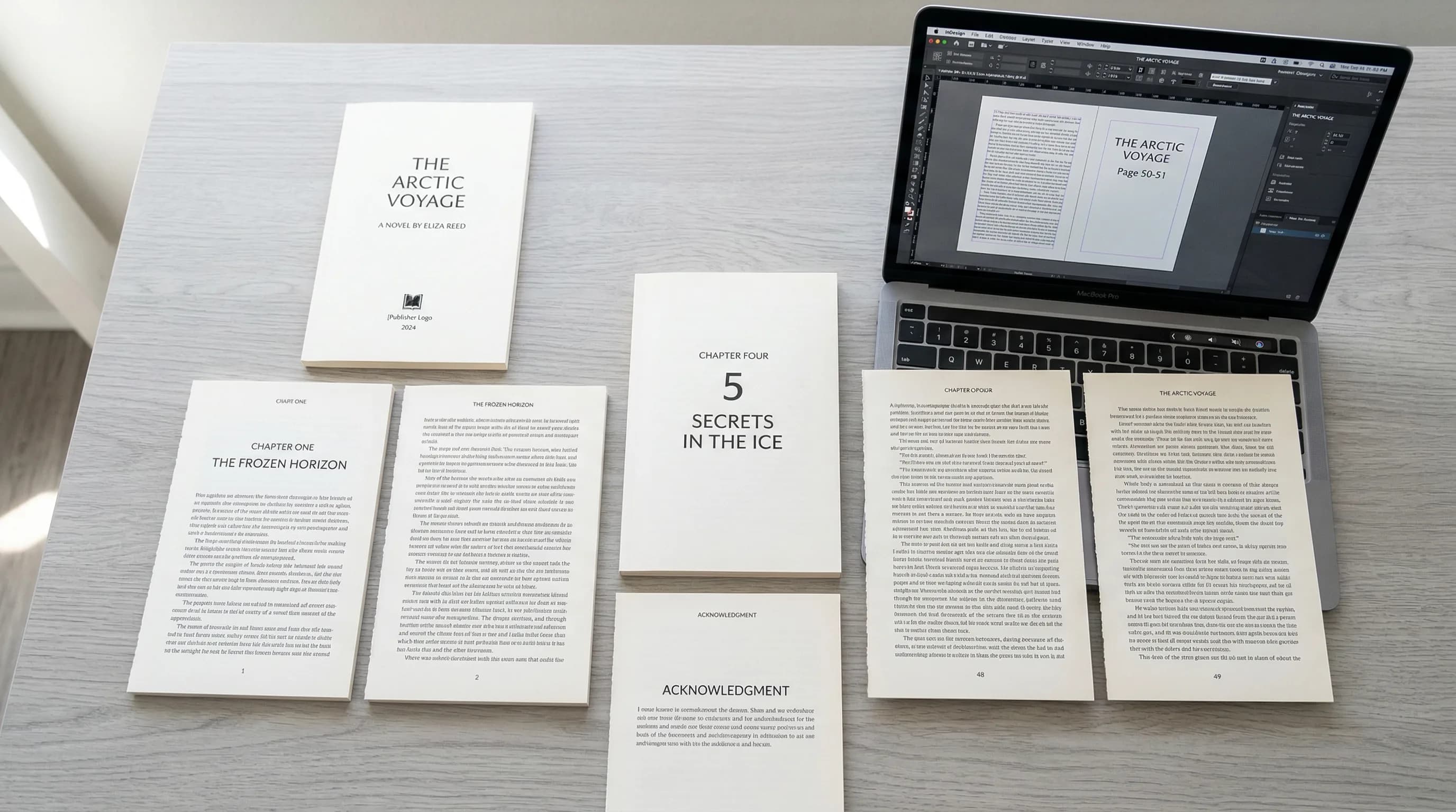
Chapter Opening Pages
Chapter openers are the most visually distinctive pages in a book. They're where layout design is most visible and where you have the most creative room.
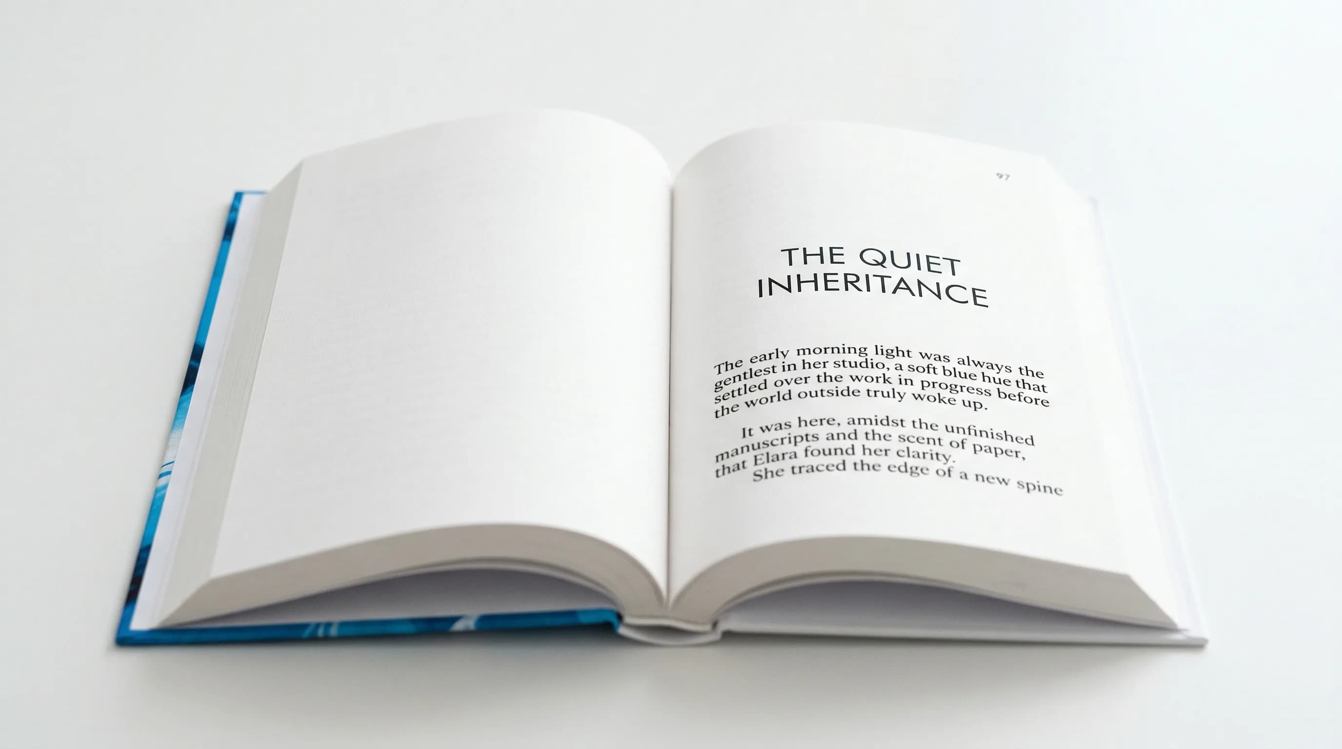
- Drop from the top: The chapter title usually starts one-third to one-half down the page. That white space at the top (called the "sink") signals a new chapter and gives the reader a visual pause.
- Chapter number: Can go above the title in a smaller size or be part of the title design. Some designs use large decorative numerals.
- First paragraph: Traditionally has no indent. Many designs use a drop cap (an oversized first letter spanning 2-3 lines) or small caps for the first few words.
- No running header or footer: Chapter openers skip headers and usually skip page numbers too, though the page still counts.
The chapter opener sets the visual tone for the whole book. A minimal opener with just a centered title and lots of white space feels literary and restrained. One with a large decorative number, a rule line, and an epigraph feels rich and detailed.
Book Layout for Different Book Types
Different genres and formats need different layout approaches. Here's how to think about each one.
Novel and Fiction
Fiction layout is the simplest form of book page layout. Which is exactly what makes it hard — there's nowhere to hide mistakes.
- Single column of continuous text
- Consistent paragraph indentation (typically 0.2" to 0.3" first line indent)
- Scene breaks shown by a blank line or a small ornament (dinkus)
- Minimal or no running headers
- Page numbers bottom center or bottom outside
- Generous margins that let the text breathe
- Line spacing (leading) of 120-145% of the font size
The main challenge is achieving an even, rhythmic texture across hundreds of pages. Every page should look like every other page. The reader should never notice the design — only the story.
Nonfiction and Business Books
Nonfiction layout is more complex because the content is more varied. A business book might have body text, subheadings at three levels, bulleted lists, numbered lists, block quotes, case studies, data tables, and images. Each needs its own visual treatment, and they all have to work together.
- Clear heading hierarchy (typically 2-3 levels of subheadings)
- Running headers showing chapter or section titles for navigation
- Pull quotes or key takeaways in a distinct style
- Sidebars or callout boxes for supplementary info
- Space above and below headings that creates clear visual structure
- Potentially wider margins for margin notes
- Define a consistent style for every element before you start: body text, each heading level, lists, quotes, sidebars, captions, and callouts.
- Use space to separate elements, not decorative borders. A sidebar set off by white space looks more professional than one in a heavy box.
- Make sure subheadings never land at the bottom of a page without at least two lines of body text after them.
Workbooks and Journals
Workbooks and journals have a unique challenge: they need space for the reader to write. That changes the whole relationship between printed content and white space.
- Fill-in lines or blank boxes for written responses
- Checkbox lists for exercises and action items
- Plenty of space between sections so entries don't feel cramped
- Often printed on heavier, more opaque paper (which affects spine width and gutter calculations)
- May include perforated pages or lay-flat binding, both of which affect layout specs
- Space response lines at least 0.35" apart (8-9mm) for comfortable handwriting.
- Keep at least 0.75" of clear gutter margin — workbooks get pressed flat while writing, which stresses the binding.
- Consider a larger trim size (7" x 10" or 8" x 10") to give readers room to write.
- Number exercises and sections clearly so readers can navigate during workshops or courses.
Cookbooks and How-To Guides
Cookbooks are some of the hardest books to lay out. They combine text, images, lists, and structured data (ingredients, step-by-step instructions, timing) on every page.
- Multi-column layouts (often two columns: ingredients on one side, instructions on the other)
- Full-color photography, usually facing the recipe
- Structured data: prep time, cook time, servings, difficulty
- Icon systems for dietary info (vegan, gluten-free, etc.)
- Cross-references between recipes
- Index organized multiple ways (by ingredient, by course, by technique)
- Set up a rigid grid system. Cookbooks fall apart visually without one. A 12-column grid gives you enough flexibility for one-, two-, and three-column configurations.
- Every recipe should start on a new page (or at least a new spread) so readers never flip back and forth mid-recipe.
- Ingredient lists and instructions should look distinct — different column widths, different backgrounds, or clear dividing rules.
- Let photographs bleed to at least one edge when possible. Photos boxed in by large margins look dated.
Children's Books
Children's book layout is image-first. The priorities are the opposite of most other books. Instead of designing a text block and fitting images around it, you place images first and find spots for the text.
- Full-bleed illustrations (images that extend to the page edge on one or more sides)
- Text worked into the illustration rather than sitting in a separate text block
- Large type sizes (14-24 pt depending on age group)
- Very little text per page (picture books might have one or two sentences)
- Trim sizes that are often square (8" x 8", 10" x 10") or landscape
- Think in full spreads, not individual pages. Most children's book illustrations span two pages.
- Don't let text placement compete with the illustration's focal point. If the visual center is top-right, put text bottom-left.
- Keep text in a consistent spot — readers (and the adults reading aloud) shouldn't have to hunt for it on each page.
- Keep important visual elements at least 0.375" from the trim edge, since cutting isn't perfectly precise.
Core Book Layout Principles
These apply to every book, regardless of genre.
Consistency Across Pages
Consistency is the most important layout principle. Every body text page should have the same margins, the same text block size, the same baseline grid, and the same header/footer treatment. Every chapter opener should follow the same template. Every subheading at the same level should have the same spacing.
When things are consistent, the book looks professional. When they're not — even subtly — something feels "off," even if the reader can't say what.
White Space and Breathing Room
White space isn't wasted space. It's an active design element that:
- Separates sections and signals structure
- Gives the reader's eye a place to rest
- Creates a sense of quality and care
- Makes dense content feel approachable instead of overwhelming
The most common amateur mistake is trying to fill every inch of the page. Don't. When in doubt, add more white space, not less.
Grid Systems
A grid is an invisible framework of horizontal and vertical lines that helps you place elements consistently. Even simple fiction uses one (the text block itself is a one-column grid). Complex layouts need multi-column grids with defined modules.
- Single column: Fiction, memoir, simple nonfiction
- Two column: Cookbooks, technical manuals, academic texts
- Three column: Magazines, some reference books
- Modular grid: Complex layouts where content of varying sizes needs to coexist
A grid doesn't mean everything aligns perfectly all the time. It means you have a system. And when you break it, you break it on purpose for emphasis.
Visual Hierarchy
Visual hierarchy makes sure readers always know what to look at first, second, and third. On any well-designed page, a reader can instantly spot:
- What chapter or section they're in (running header)
- The main content (body text)
- Secondary content (sidebars, captions, footnotes)
- Navigation elements (page numbers, cross-references)
You create hierarchy through size, weight, position, and spacing — not decoration. A heading that's larger, bolder, and has generous space above it will naturally draw the eye before the body text below.
Common Book Layout Mistakes
These are the errors that most often make a book look self-published:
Book Layout Templates and Tools
If you're handling layout yourself, templates give you a solid head start. A good one pre-configures trim size, margins, text block dimensions, heading styles, chapter opener formatting, and running headers — the structural stuff that's hardest to nail from scratch.
- Correct margin ratios for your trim size (not equal margins on all sides)
- Pre-built paragraph styles for body text, headings, block quotes, lists, and captions
- Proper chapter opener formatting with the right sink
- Running headers set up for recto and verso pages
- Page number placement and suppression rules already done
- Master pages or style sheets that keep the system easy to maintain
Traditional tools like Adobe InDesign give you maximum control but take time to learn. Word processors like Microsoft Word or Google Docs can work for simple fiction layouts but struggle with complex pages. Dedicated book formatting tools sit in the middle — book-specific features without the steep learning curve.
Putting It All Together
Book layout is part technical, part visual. The technical side — margin ratios, trim sizes, gutter compensation, folio placement — gives you the structure. The visual side — white space, hierarchy, the rhythm of chapter openers, the balance of a spread — gives you the reading experience.
Here's a practical sequence for laying out a book:
- Choose your trim size based on genre, content type, and target page count.
- Set your margins using the ratios above, with extra gutter for thick books.
- Define your text block as the space left after margins. Check that line length falls in the 55-75 character range at your chosen font size.
- Design your chapter opener — sink depth, title treatment, first-paragraph style.
- Set up running headers and page numbers — what info appears, where, and which pages suppress it.
- Build styles for every element — body text, each heading level, lists, block quotes, sidebars, captions, and anything else that repeats.
- Flow your text and review — check for widows, orphans, bad breaks, heading placement, and overall rhythm.
- Review as spreads — print or export and look at every two-page spread, not individual pages.
A well-laid-out book doesn't call attention to itself. It just makes reading feel effortless. That invisible quality — the sense that a book was made by people who knew what they were doing — is what earns reader trust.
Your words deserve a layout that does them justice.
Tomas Placko
“Good layout is invisible. Readers never notice it — they just keep turning pages. That's exactly how you know it's working.”
Recommended Reading
Book Design: The Complete Guide to Designing a Professional Book
Master book design with this definitive guide to covers, interior layout, and typography. Learn how to design a book that looks professionally published.

Book Manuscript Format: The Complete Guide to Formatting Your Manuscript Right
Learn the standard book manuscript format with exact specs for fonts, margins, spacing, and more. Covers fiction, nonfiction, submission, and self-publishing formats.

Book Typesetting: The Complete Guide to Professional Interior Layout
Learn book typesetting fundamentals — fonts, spacing, margins, and more. Master professional interior layout or let AI handle it for you.